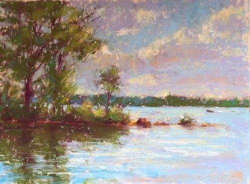
Painting Moving Water: How Plein Air Artists Master Lake Glare and Shifting Waves
The Living Mirror of Freshwater Lakes
Standing beside a freshwater lake with a sketchbook or watercolor set is an invitation to observe a scene that refuses to remain still. The surface may appear calm from a distance, yet every breeze alters the pattern of reflected sky, every passing cloud shifts the temperature of the light, and every small wave breaks the image of the shoreline into moving fragments. For artists working near regional lakes, this changing surface offers a rich form of seasonal inspiration, but it also demands more than a quick transcription of what appears before the eye. The most successful plein air studies begin with patient looking and a clear understanding of how light behaves.
Lake water can feel more elusive than a static hillside because it is both subject and mirror. An ocean swell often announces its direction through larger, more legible rhythms, while a freshwater lake may combine nearly imperceptible ripples, transparent shallows, dark submerged depths, and brilliant points of glare within a single view. Detail pursued too quickly becomes confusing. A disciplined painter instead establishes the large value relationships first, then allows horizontal marks, restrained color, and carefully preserved lights to suggest movement. This approach transforms fleeting observation into a coherent painting that can communicate the character of a shoreline long after the light has changed.
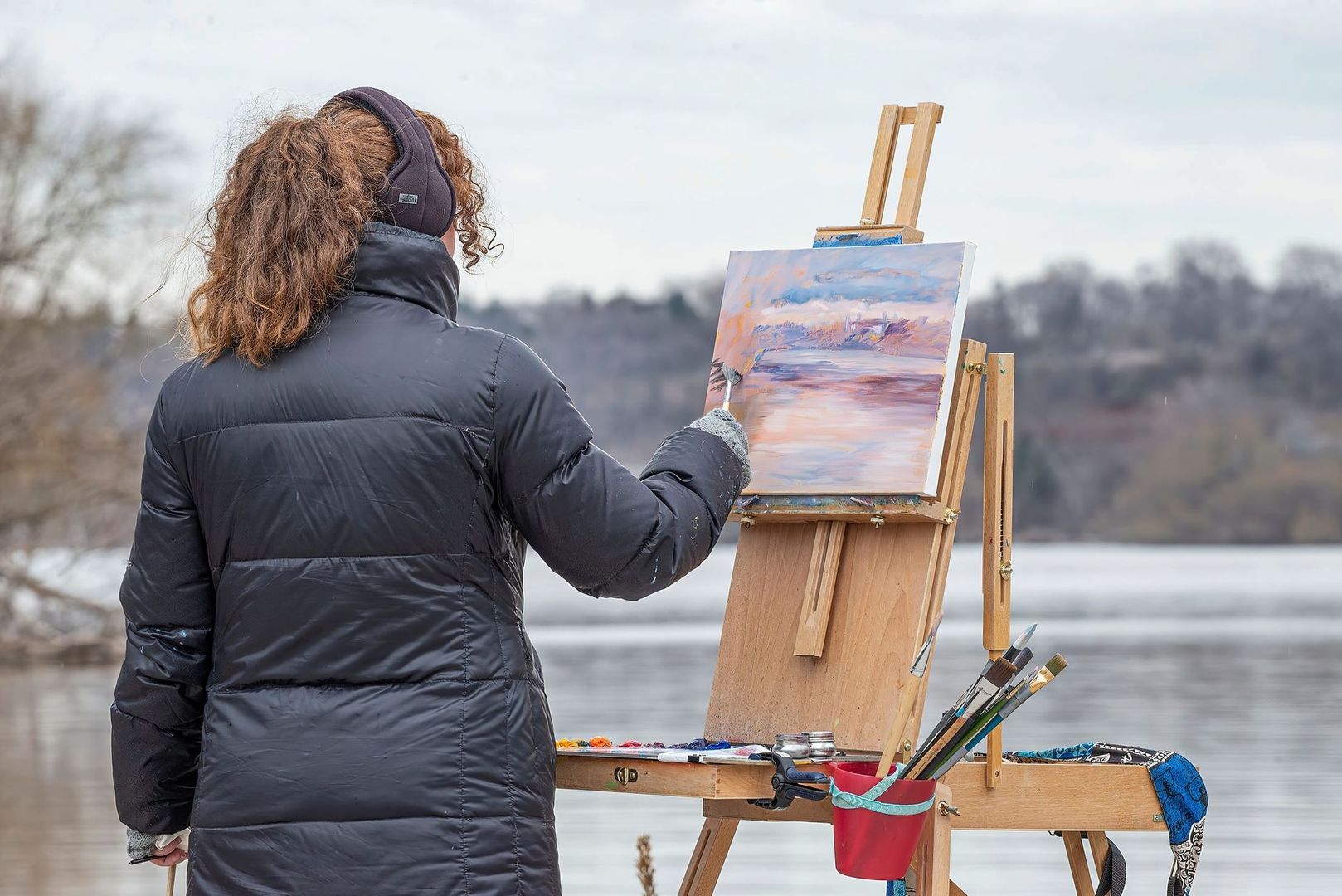
The Physics of Lake Glare and Fresnel Reflections
The surface of a lake is governed partly by the Fresnel effect, an optical principle describing how reflectivity changes with viewing angle. When an artist looks almost straight down into relatively shallow water, more light can pass through the surface, revealing stones, sediment, vegetation, or darker submerged forms. As the viewing angle becomes shallower, especially toward the distant horizon, the surface reflects more of the sky and surrounding landscape. The same patch of water can therefore appear transparent near the feet and mirror-like farther away, not because the water has changed, but because the relationship between surface, light, and viewpoint has changed.
This distinction helps resolve a frequent plein air puzzle. Deep water may be represented by a cool, dark tone, while wave crests facing the sky catch pale, high-value reflections. The bright line on a ripple is not necessarily the local color of the water. It may be reflected sunlight or sky, and its shape depends on the angle of the tiny plane created by the wave. The painter must therefore separate the underlying value of the lake from the temporary highlights moving across it. A dark blue or green foundation can support a sequence of lighter, broken horizontal accents without requiring every accent to be mixed as a new color.
Perspective also affects temperature and contrast. Foreground water, viewed at a steeper angle, may show warmer earth colors, submerged vegetation, or sediment beneath the surface. Distant water generally carries more of the sky reflection and atmosphere, making it cooler, lighter, and less sharply defined. Reflections of trees, buildings, or hills should be placed beneath their source forms, but they need not be literal vertical copies. Wind and ripples stretch, interrupt, and soften them. The following guide can help organize the observation before paint is applied.
| Viewing area | Optical tendency | Painting implication |
|---|---|---|
| Near foreground | More transparent, with stronger evidence of bottom or submerged forms | Use warmer earth notes, darker accents, and broken surface marks |
| Middle distance | Mixed transparency and reflection | Balance local water color with reflected sky and shoreline shapes |
| Distant shoreline | More reflective because of the shallow viewing angle | Use cooler, lighter, and softer passages with fewer hard edges |
These relationships are more dependable than memorizing a single “water color.” A lake may be blue, green, brown, silver, or violet within minutes, yet its value hierarchy can remain understandable. Observing which areas are darkest, which lights are reserved for glare, and where edges dissolve gives the painting structure even when weather and reflections remain unstable.
Restricting Your Palette to Tame Chaotic Natural Light
A lean palette is especially useful beside moving water because it reduces the number of decisions made under pressure. Too many pigments encourage repeated mixing as the sun shifts, and repeated mixing can produce dull, unrelated passages. A compact color string keeps mixtures visually connected. The principle is demonstrated in John Lovett”s limited palette, which uses Burnt Sienna, Indigo, white Gouache, a small number of brushes, and lightweight containers to focus attention on tone, shape, line, and texture. The value of such a system is not that every lake requires the same pigments, but that restrictions can make observation faster and clearer.
Earth colors provide useful anchors in freshwater scenes. Burnt Sienna, raw umber, or another transparent earth pigment can suggest shoreline soil, submerged sediment, sun-warmed rocks, and the warm notes that prevent blue water from becoming sterile. A deep blue such as Indigo or Ultramarine can establish distant depth, shadowed reflections, and the cool foundation beneath sparkling highlights. The contrast between warm foreground notes and cooler distance can support atmospheric perspective without relying on excessive detail. As the palette survey in OutdoorPainter”s artist palette guide shows, experienced landscape painters organize pigments according to temperature, transparency, permanence, and personal mixing habits rather than following one universal formula.
Field equipment should protect both pigment purity and the paper”s brightest lights. A small airtight palette, a dependable water container, a cloth for controlling moisture, and a limited selection of brushes are often more useful than a large traveling kit. Watercolor painters should decide before painting where the white paper will remain untouched. Outdoor watercolor guidance from Etchr Lab”s plein air techniques emphasizes that clean whites are difficult to recover once covered, although white gouache can restore an area with a different, more opaque character.
- Choose one warm earth pigment, one deep blue, and a small number of supporting colors suited to the specific lake.
- Keep clean mixing space available so dark passages do not contaminate pale sky reflections.
- Carry a sponge or absorbent cloth to modify washes and create broken water texture without adding more pigment.
- Reserve the paper or ground for the highest lights, including sun flashes on wave crests and narrow reflected openings.
- Mix enough neutral dark before the surface becomes urgent, then adjust it with small temperature changes rather than rebuilding every stroke.
Step-by-Step Value Blocking for Shifting Waves
Begin before the full sheet or canvas is committed. A thumbnail value sketch made with graphite, charcoal, or a single dark watercolor can reveal whether the lake”s main light pattern is strong enough to carry the composition. Identify the horizon or waterline, the largest land masses, the darkest water area, and the principal path of glare. A compact study also allows experimentation with cropping. The process described in Liz Haywood-Sullivan”s preparatory studies demonstrates how repeated small drawings can clarify value structure, proportion, and focal placement before the final work begins.
Once the pattern is understood, block broad tonal masses while the illumination is still relatively consistent. Avoid drawing each ripple as an isolated object. Instead, treat the lake as a connected field of horizontal or slightly angled bands. Establish the distant water, middle water, and foreground water as related shapes, then place the shoreline reflection beneath its source. A broad first wash or large opaque passage gives later marks something to attach to. If the underpainting is fragmented from the beginning, subsequent wave accents may appear decorative rather than structural.
Water”s surface anatomy becomes clearer when brush direction follows the plane. Near the horizon, strokes are narrow and restrained. In the foreground, they can become longer, wider, and more varied, but they should still support the horizontal movement of the lake. Elliptical ripples can be suggested with curved fragments rather than complete outlines. A reflected tree may descend as a broken vertical shape, yet the water that interrupts it should be horizontal. This distinction is central to practical reflection studies such as guidance on painting water reflections, which also recommends softer, less defined reflections than the objects above the waterline.
- Make two or three thumbnail studies and reduce the scene to three or four values.
- Mark the waterline and reserve the main glare path before applying large washes or opaque passages.
- Place the broadest dark and middle-value masses, keeping the distant water quieter than the foreground.
- Reflect major shoreline shapes below the waterline, then soften and break them with horizontal marks.
- Add progressively smaller wave forms, using brush angle and pressure to distinguish near water from distance.
- Step back frequently and remove or soften marks that compete with the focal area.
Work quickly enough to record the dominant light, but not so quickly that every changing ripple becomes a command. The lake will never offer an exact repeat of its surface. The purpose of the field study is to identify the enduring structure beneath the movement. When the sun shifts, adjust the next passage in relation to the established values rather than attempting to repaint the entire surface.
Handling the Glare Highlights and Sparkle Strokes
High-key highlights carry enormous visual power, so they should be planned rather than scattered everywhere. In transparent watercolor, the cleanest sparkle often comes from preserving the white paper beneath the wash. Small reserved shapes can describe a chain of reflected sunlight more convincingly than dozens of opaque dots. Where a highlight has been lost, a deliberate dab of white gouache can restore it, but the mark should remain integrated with the surrounding rhythm. Instructional work on reflective ponds, including Lynn Gertenbach”s reflections lesson, reinforces the importance of developing large shapes before introducing delicate color and sparkling accents.
Over-sparkling is one of the quickest ways to flatten a lake. If every wave receives the same bright stroke, the viewer loses any sense of distance, wind direction, or focal emphasis. Reserve the sharpest lights for the area where the composition needs attention, then let the rest dissolve into quieter middle values. Micro-ripples can function like horizontal calligraphy: repeated, varied, and directional marks that guide the eye across the water. Their rhythm should change with scale, becoming shorter and less contrasty toward the horizon, while remaining broad and confident in the foreground.
- Preserve the brightest paper or paint for a limited glare path.
- Vary highlight length, spacing, opacity, and temperature to avoid mechanical repetition.
- Keep distant sparkles smaller and lower in contrast than foreground accents.
- Use horizontal marks to establish the lake”s plane, even when reflections contain vertical shapes.
- Soften competing highlights so the viewer”s eye remains within the intended composition.
Claim Your Shoreline and Paint the Translucent Day
Painting a freshwater lake en plein air brings optical science and responsive mark-making into the same creative practice. The Fresnel effect explains why a surface becomes more reflective toward a shallow horizon, while value grouping explains how a painter can make those changing reflections legible. A restricted palette keeps mixtures unified, and disciplined horizontal brushwork gives the water a convincing plane. Together, these tools offer a reliable framework without removing the freedom that makes outdoor painting rewarding.
Set up beside a local lake at different times of day and treat each session as hands-on learning rather than a test of perfect imitation. Trust the relationships between dark depth, reflected sky, warm shallows, cool distance, and reserved glare. The waves will change, but the painting can remain coherent when its tonal hierarchy is secure. In that balance between careful observation and fluid response lies the enduring pleasure of painting a translucent day, preserving a brief meeting of light, water, weather, and place for the wider creative community to experience.
